Histograms: an anti-rationale
Or: Why Histograms are the New Pie Chart
Introduction
Although pie charts are commonplace, those skilled in the art of data visualization disparage them as a poor vehicle for conveying information. Wedges, the unit being compared in a pie chart, are not something the human visual system is designed to compare with much accuracy. Furthermore, many good alternatives exist, such as bar charts, that lose no information and are easier for humans to digest accurately.
I argue that histograms are more akin to pie charts than bar charts. In other words, they do not play well with the human visual system, and a good alternative exists. This article examines the primary flaw of histograms.
The problem of histograms
The major problem with histograms is that they require that the bin boundaries are decided before they can be drawn. A histogram without bin boundaries is a meaningless concept; the bin boundaries must be decided. And the bin boundaries reflect nothing at all essential about the data. Indeed, the whole concept of "bins" is something that is rarely inherent in a dataset, but rather a concept introduced by the histogram itself. Although there's nothing wrong with this in theory, it becomes problematic because the bin boundaries greatly affect the histogram's shape. In other words, the bin boundary selection is not only irrelevant to the data, it is highly relevant to the histogram's display.
To see this in action, consider 200 randomly chosen integers between 0 and 99 inclusive. The following histograms show the same dataset with 5, 10, 20, and 50 bins.
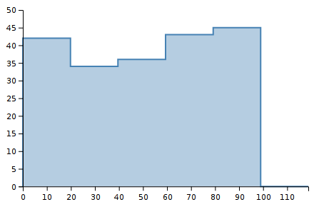
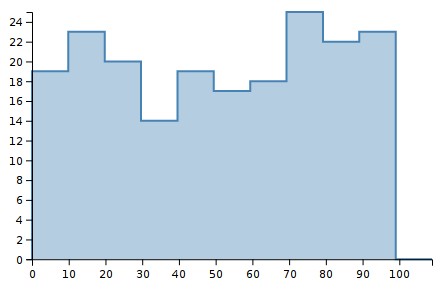
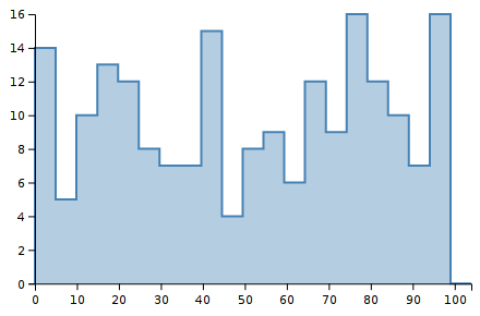
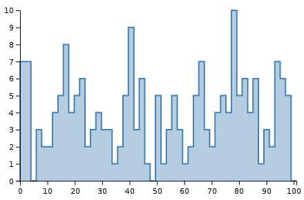
Notice how the shape of the histograms are very different. Shape is important to our visual system. We notice it strongly. These images look very different to our eyes, yet they are displaying the same data. Thus, the choice of bin boundaries matters.
As a secondary concern, notice how the y-scale changes. The first chart goes up to Y=50, and the last chart only goes up to Y=10. This makes perfect sense when you consider what a histogram is doing: counting the number of observations per bin. But it is another aspect of how histograms are not stable for a data set but depend on other choices as well.
Heuristics such as the Freedman–Diaconis rule, as well as many others, exist to automate the bin boundary selection process. They work well in most cases, although they can run into problems with some data sets. But the problem remains: bin boundaries are irrelevant to the data but crucial to the histogram's display.
The alternative: CDFs
I've spent some time discrediting histograms. They're not awful, but they do have some significant shortcomings. The real problem with them is that a very good alternative exists: the CDF, or cumulative distribution function. The CDF has several advantages. First, it includes all of the same data as a histogram and more. Second, it works better with the human visual system. Third, it allows for natural visual comparisons between multiple datasets on the same chart. Fourth, it scales to larger datasets. Fifth, it is not sensitive to noise like a histogram is (although it also doesn't suppress it artificially). Finally, it has a single representation for a dataset, with no parameters like bin boundaries that can affect the display.